
UnStumble
Application Design Case Study
Mission:
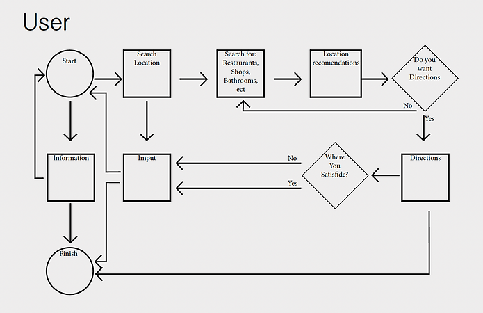
This App creates a network to help people with mobility issues get around and find places that are accessible to wheelchairs and other mobility devices. Walking around a large city like New York you would never think to ask yourself if shops, restaurants, other establishments, and even buildings are accessible to all its inhabitants and visitors. What might be shocking is when you realize that most world hubs are in fact not built accessibly for all people. When making plans with friends no one would ever think to see if the location is accessible unfortunately this is not the case for many people. With this app, you’ll easily be able to check not only if the location itself is accessible but also what the neighborhood is like and how the commute there will be. This app will allow user-generated data about locations which will be verified by the admin as well as integrated subway/transportation maps with real-time data and other information that is necessary for people with limited mobility.
Interview/ insights:
“Businesses don’t know what it is to be accessible, some of them are and don’t know
and some aren’t and think they are... Accessibility can mean so many things. Some people are confined to a wheelchair and need ramps or flat ground that has space to round curves, people with walkers are able to do some steps but it is difficult for them to do more than 2/3 steps and escalators... Subway stations don’t just need to have elevators, which aren’t always working in the city, they also cannot have a very wide gap between the train and the platform because wheelchairs cannot jump over these gaps”
- Madeline 26
“Getting around streets in NY is difficult when there's construction because wheelchairs cant take such bumpy terrain”
- Ben 24
“Restaurants tend to use handicapped stalls for storage, this basically defeats the purpose of the stall and makes it no longer accessible”
- Sarah 27


Competitive advantage:
AXS Map: This website is also based on user data but it does not include transportation there. Its interface is a bit difficult to use and does not give any information about accessibility. They have too many things in their filters which could be better organized in other places on the site. The website has a thing called Mapathon which takes you to a donation page but does not explain it.
Google: you would have to Google each individual location and if you’re trying to plan an outing with friends it's a lot of individual searches just to go out for a few hours. Information on Google might be out of date.
Yelp: does not talk about accessibility unless specific users add reviews talking about it. Ways: does really well with getting cars around but they don’t do this for pedestrian traffic
Moovit: tells you all the alerts in the subway and other public transits and tells you a very accurate time of arrival including walking to and from the transit but it does not tell you about street construction.
Some accessibility standards:
The W3C recommends the following contrast ratios for body text and image text:
Small text should have a contrast ratio of at least 4.5:1 against its background. Large text (at 14 pt bold/18 pt regular and up) should have a contrast ratio of at least 3:1 against its background.
Touch targets are the parts of the screen that respond to user input. They extend beyond the visual bounds of an element. For example, an icon may appear to be 24 x 24 dp, but the padding surrounding it comprises the full 48 x 48 dp touch target.
Touch targets should be at least 48 x 48 dp. A touch target of this size results in a physical size of about 9mm, regardless of screen size. The recommended target size for touchscreen elements is 7-10mm. It may be appropriate to use larger touch targets to accommodate a larger spectrum of users.
Don’t put the fill-in info in the typing field because it disappears when people jump from one to the other.
Process:
Challenges and Compromises:
This project was all about accessibility, so it is no surprise that that was my biggest challenge. When it came to icons, buttons, and text, I had to design with mobility challenges in mind, limiting the sizes of all the elements. Colors were also a challenge I kept in mind - having changed my color pallet multiple times until I found one that both suited the style of the app but also were compliant with the W3C standards.
Other challenges I encountered while conceptualizing this app were differentiating itself from google and other search engines as well as preexisting apps that have some of these functionalities - what would bring people to this app out of all other apps. I solved some of these by having a more comprehensive filtering system that you cannot find on google or even by calling locations on your own. Other ways I differentiated my app was by educating and not only focusing on people who face these challenges every day, I wanted an all-inclusive app, and although I believe I created that there are many functionalities that could be added in the future to better include all members of society.


